 CRO Audit
Arda
Audit performed April 26, 2026 · Report version 2.0 · 21 CRO suggestions identified
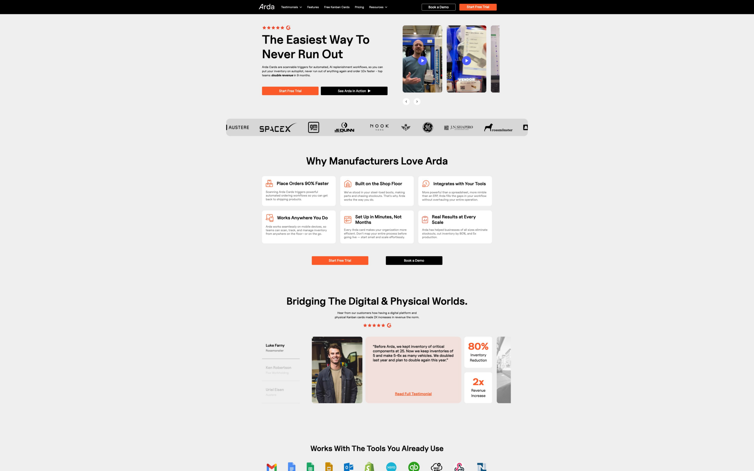
The headline 'Arda | Replace VMI with Manufacturer-Controlled Replenishment' is somewhat technical and may not immediately communicate the core benefit to new visitors. The subheadline and supporting text mention benefits like 'never run out of anything again' and 'double revenue in 9 months,' but these are scattered and not clearly connected in a succinct value proposition. This lack of clarity can confuse visitors, reducing engagement and conversion rates, as users may not quickly understand what problem Arda solves or why they should choose it.
The site includes multiple CTAs such as 'Start Free Trial,' 'Book a Demo,' and 'Log In,' but they are dispersed throughout the content and sometimes linked to the same or unclear destinations. The CTAs lack strong visual or textual emphasis in the text content, and the user journey to conversion is not clearly guided. This can cause confusion or decision paralysis, reducing conversion rates from visitors to leads or trials.
While there is a link to a pricing page, the text content does not provide any pricing details or hints about cost, plans, or value tiers. Lack of transparent pricing information can create friction and hesitation for potential customers, especially in SaaS where pricing is a key consideration. Visitors may leave to seek pricing elsewhere or abandon the site if they cannot quickly assess affordability.
The site includes multiple testimonials with impressive metrics (e.g., '600% production increase,' '100% stock outs eliminated'), but the text content repeats some testimonials multiple times and lacks diversity in formats such as video or case study summaries. Also, some testimonials are truncated or incomplete in the text. This repetition and lack of depth may reduce credibility and engagement, limiting trust-building with prospects.
The navigation includes links to resources like Blog, Press, Comparison Hub, and Knowledge Base, but the text content shows these links are repeated multiple times and sometimes lack descriptive context. This can confuse users about where to find helpful information or how to use the resources effectively, potentially increasing bounce rates and reducing engagement.
Want to unlock the full CRO report?
Get access to all recommendations, benchmarks, and experiment ideas.
- All 21 prioritised CRO suggestions with experiment ideas
- Industry benchmarks for your category & traffic level
- Discoverability (SEO + GEO) full audit results
- A/B test hypotheses ready to implement
- Personalised session with a CRO specialist
⚠️ Important Note
This audit is based on an automated and heuristic-based analysis of publicly accessible pages. The evaluation follows industry best practices across conversion rate optimization (CRO), usability, analytics, and discoverability.
The findings presented here are directional and indicative in nature. They do not take into account internal data such as revenue performance, customer lifetime value, traffic quality, seasonality, or proprietary testing.
Recommendations should be interpreted as optimization opportunities rather than absolute assessments. Actual impact may vary depending on audience composition, acquisition channels, and business context. This report is not exhaustive and should be used as a starting point for further analysis and experimentation.